
Sherborne Chamber of Trade and Commerce - Brand Identity & Website
Sherborne Chamber of Commerce needed a rebrand. They wanted to feel fresh and modern to attract new businesses to join - while still reflecting the character of this historic Dorset town.
I was brought in to lead a full rebrand - creating a fresh identity that would modernise the Chamber's image while staying true to Sherborne's heritage and character.
Client
Sherborne Chamber of Trade and Commerce
Website
sherbornechamber.co.uk
Sector
Business community / Chamber of Commerce
Service
Full rebrand - Logo design, brand guidelines document, and website design.
The brief
Sherborne Chamber had over 150 members but their existing branding felt outdated. It no longer reflected the modern, forward-thinking community they represented. They needed a refreshed identity that would attract new businesses to the town while honouring Sherborne's heritage.
What I delivered
Logo and full brand identity, brand guidelines document, and website design.
The story
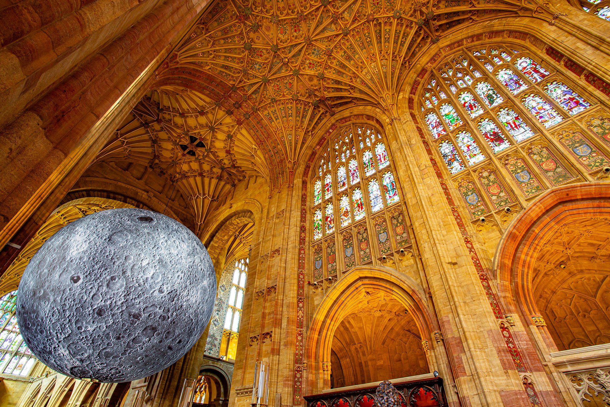
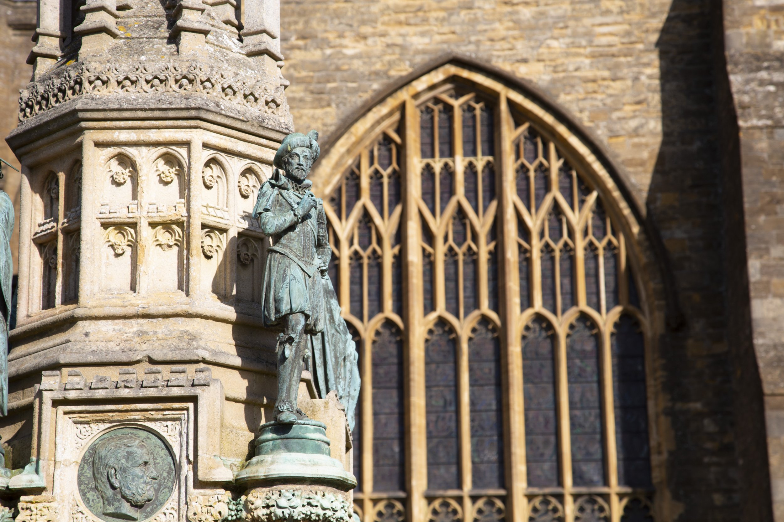
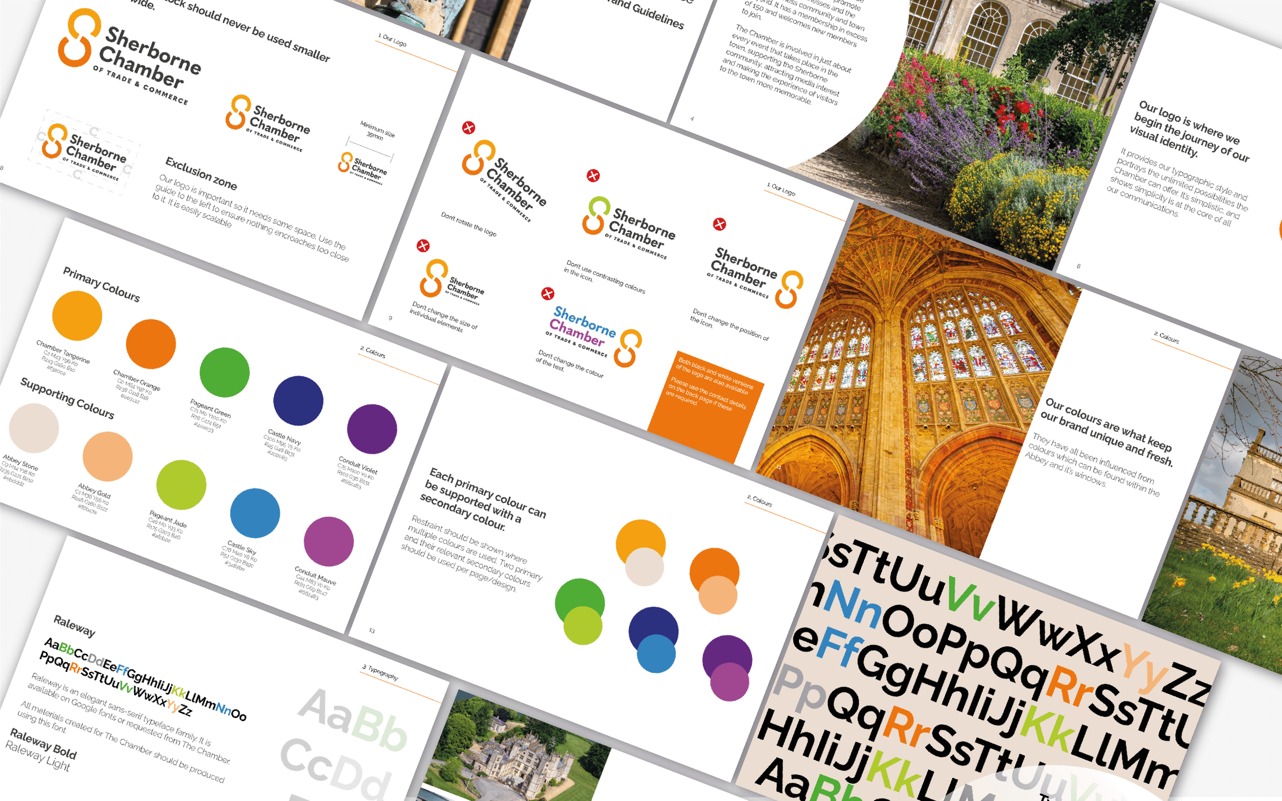
The brief was open, which gave me room to explore. Sherborne is famous for its Abbey, so I used that as the starting point for the colour palette - drawing on the warm oranges of local hamstone and the tones of the Abbey's stained glass.
For the logo, I developed a graphical element that contains the letters S, C, C within it. The shape can also be read as interlocking chain links - a subtle nod to the Chamber's role in connecting local businesses. It's a detail I'm really proud of, and the brand is still solidly in place today.


What Sherborne Chamber had to say

Sherborne Chamber of Commerce